Blue Dragon Picture Book Dummy
January 12, 2021 by Rachel
I illustrated this story for a workshop that was part of the 2020 Houston SCBWI Conference. I was under time restraints for this, so none of the images are as polished and consistent as I’d like. If you look closely, you’ll find plenty of pencil lines and color gaps.
The assignment was to illustrate, in 3 spreads, a childhood challenge that we solved by our own initiative. I struggled to think of one: I was more of an adapt-and-just-pretend-everything-was-all-right kind of kid. What I came up with isn’t a story I would ever expand for a picture book, and I changed my normal style of drawing the characters…so this isn’t something that will end up in my portfolio either. But I’d like to learn as much as I can from the project.
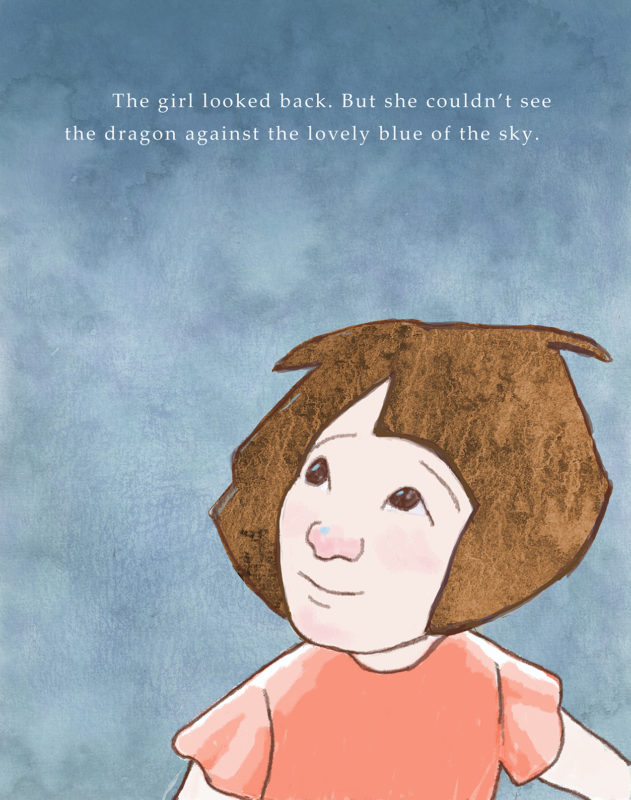
The text of page 8 reads: “The girl looked back. But she couldn’t see the dragon against the lovely blue of the sky.”
Although the assignment was for three spreads, I got the organizer’s blessing to add a title page and end page.
The biggest lesson I got from this assignment is that it’s really hard to tell a complete story in so few pages…32 pages now seems like a wide-open prairie to me.
When I first posted this, I opened this page and my social media for comments. I’ve since closed the comment section (and I truly thank everyone who gave me feedback!), but I thought I’d leave the questions up just in case they are any help to anyone who is working on a similar project.
Questions:
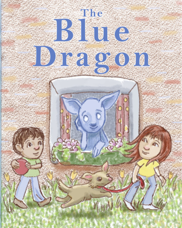
First Page: The two children and dog shown on the front page aren’t shown again in any of the other pictures. Did you expect to see them again? Would this picture be better with just the dragon looking out the window?
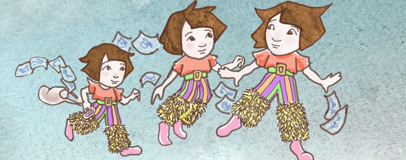
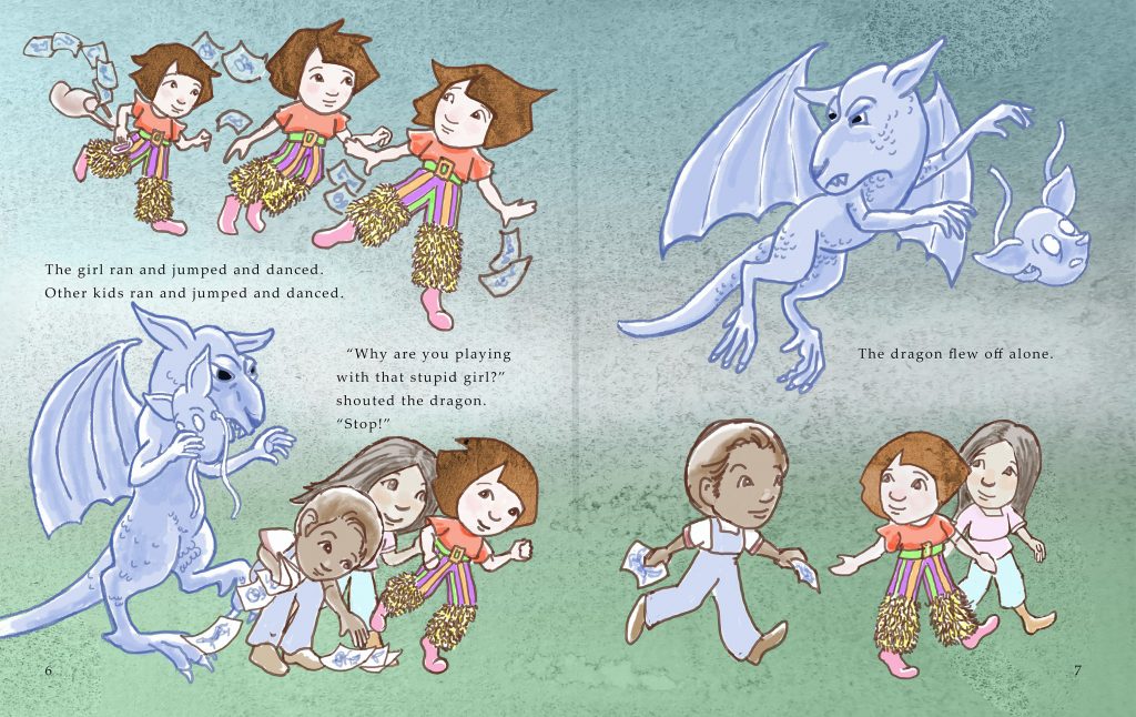
The Dragon: At what point did you understand that the Dragon often wore a mask? I wanted to show that the Dragon acted very differently when alone with the girl. Originally, I drew the Dragon as having two heads, but that seemed more like duality of personality versus two-faced-ness. Fun Fact: I designed the Dragon’s feet after my chickens’: they were more than pleased to pose for me.
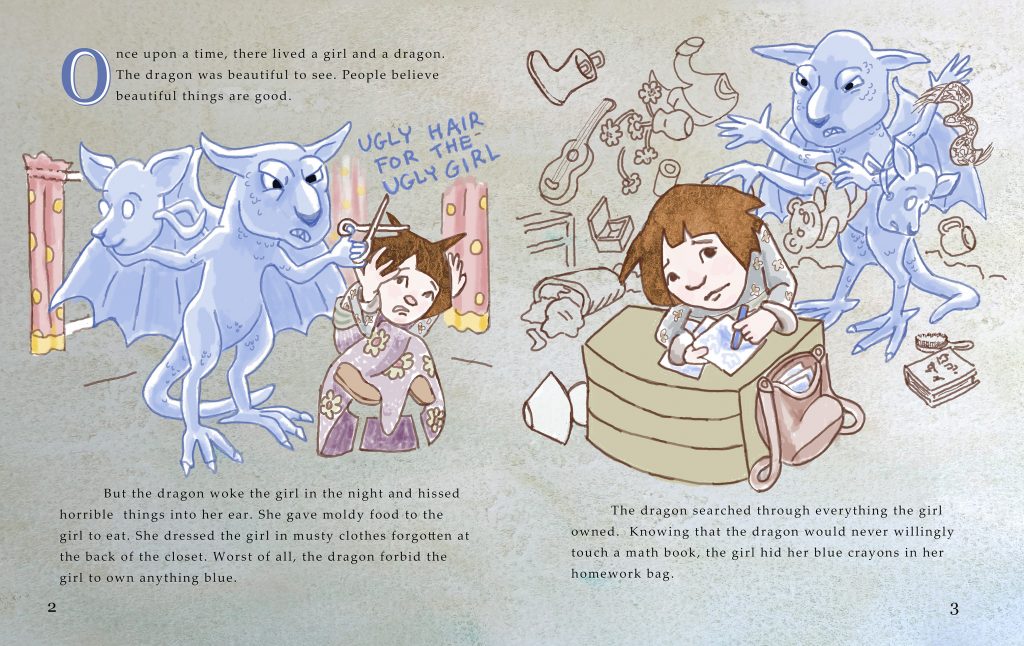
The Stool: On page two, I tried to indicate the stool the girl is sitting on by using her skirts as negative space. Two people felt it didn’t read as a stool. Is that area confusing? Show of hands?
Changing Colors: Because I never intended to have this printed out as a book, I was able to illustrate in RGB (for computer screens) instead of CYMK (the four ink colors used in most printing). This kept the colors much brighter. I tried to gradually increase the brightness from pages 2 to 8 (I figured page 1, as an opening page shouldn’t be drab, as it wouldn’t be as grabby). While you were reading, did you notice how the treatment of background color changed?
Any other thoughts or responses to this project would be greatly appreciated!


